


14 Aug ESS IA Graphs: Create Examiner-Ready Visuals for IB ESS
For most ESS IA data types, a scatter plot (continuous paired data), line graph (time series), or bar chart (categorical or discrete counts) will serve you best. Before you submit any figure, run this six-step check: (1) label both axes with the variable name and units, (2) choose a scale that starts at zero unless you have a clear reason not to, (3) add a trendline with R² when you have continuous paired data, (4) show uncertainty through error bars or a range, (5) write a caption that states what is plotted and your sample size, and (6) assign a figure number and reference it in your text.
Knowing how to create IA graphics that actually satisfy the examiner is what separates a 6 from a 7 on data presentation. The ESS IA counts for up to 25% of your SL grade and 20% at HL, so every graph you submit carries real weight. This guide walks you through graph selection, labeling, tool-by-tool steps in Google Sheets and Microsoft Excel, formatting for accessibility, and a rubric-aligned checklist you can run the night before submission.
Key Takeaways
Matching your graph type to your data structure and labeling every axis with full variable names and SI units are the two changes that most reliably improve ESS IA data presentation marks.
| Point | Details |
|---|---|
| Match graph to data type | Use scatter plots for continuous paired data, bar charts for discrete counts, and line graphs for time series. |
| Label axes completely | Include the full variable name and SI units on every axis; never abbreviate without a legend. |
| Show uncertainty always | Add error bars (± 1 SD or range) to every figure that has replicate measurements. |
| Caption every figure | Include figure number, what is plotted, sample size, and an uncertainty note in every caption. |
| Esstutor IA coaching | One-on-one sessions review your draft graphs against the IB rubric before you submit. |
Table of Contents
- Which graph type matches your ESS IA data?
- What every examiner expects on an IA graph
- How to build your graph in Google Sheets or Microsoft Excel
- Formatting your graphs for clarity and accessibility
- How to embed and reference graphs correctly in your IA
- What commonly loses marks on ESS IA graphs
- What an experienced IB ESS examiner actually looks for
- Annotated exemplar graphs and templates you can copy
- What I see students struggle with most on IA graphs
- Esstutor can help you get your ESS IA graphs right
- Sources
Which graph type matches your ESS IA data?
Choosing the wrong graph is one of the most common ways students lose marks before an examiner even reads a caption. The table below maps the five data types you will most often encounter in an ESS IA to the recommended graph and a typical fieldwork example.
| Data type | Recommended graph | Typical ESS IA example |
|---|---|---|
| Continuous paired (two variables) | Scatter plot with trendline | pH vs. dissolved oxygen across river sites |
| Time series (one variable over time) | Line graph | Pollutant concentration measured weekly |
| Discrete counts (species, individuals) | Bar chart or histogram | Species richness per quadrat along a transect |
| Categorical proportions | Pie chart or stacked bar | Land-use categories in a study area |
| Comparative groups (means ± SD) | Bar chart with error bars | Mean leaf area index in disturbed vs. undisturbed forest |
A few practical notes on choosing between acceptable options:
- When two graph types both fit, pick the one that makes your research question clearest. A stacked bar usually communicates proportional change across sites better than a pie chart when you have more than two categories.
- Histograms suit continuous data you have grouped into bins (e.g., turbidity readings grouped in 5 NTU intervals). Bar charts suit genuinely discrete categories.
- If you have paired data from the same site measured twice (before/after a treatment), a paired bar chart or a scatter plot of before vs. after values both work. The scatter plot is stronger if you want to show correlation.
The RevisionDojo 2026 ESS IA overview is worth reading alongside this section because it explains how examiners link your graph choice to the quality of your analysis.
What every examiner expects on an IA graph
Getting the graph type right is step one. Getting the labeling right is what actually earns the marks. Here is what must appear on every figure you submit.
Axis labels and units. Write the full variable name followed by the unit in parentheses: Dissolved Oxygen (mg L⁻¹), not just “DO” or “oxygen.” Use SI units wherever possible and apply consistent significant figures throughout. If your data has three significant figures, your axis tick labels should too.
Scale and tick intervals. Start numerical axes at zero unless you are plotting a variable that cannot logically reach zero (e.g., pH, temperature in °C). Use evenly spaced tick intervals. An axis that jumps from 0 to 5 to 15 to 100 misleads the reader about the rate of change in your data.
Legend and symbols. When you plot more than one data series, include a legend that uses distinct symbols or line styles, not just color. This matters for print submissions and for color-blind readers.
Caption template. Every figure needs a caption directly below it. A reliable template:
Figure [N]: [Short title describing what is plotted]. [Site/sample description, n = X]. [One sentence linking the figure to the research question or key finding.]
Example: Figure 2: Mean species richness per quadrat across three land-use zones (n = 10 quadrats per zone). Species richness declined with increasing human disturbance, supporting the investigation’s hypothesis.
Pro Tip: Write your caption before you finalize the graph. If you struggle to summarize what the figure shows in one sentence, the graph may be trying to do too much.
Additional checklist for each figure:
- Title (if required by your school’s IA template) is concise and descriptive, not generic (“Graph 1”).
- Units are consistent between the axis label and the data table in your appendix.
- Trendline equation and R² value appear on the graph when you use a line of best fit.
- Error bars are labeled in the caption or legend (e.g., “error bars represent ± 1 SD”).
How to build your graph in Google Sheets or Microsoft Excel
Both tools can produce examiner-ready figures. The steps below are specific enough to follow without screenshots.
Google Sheets
- Prepare your data. Put your independent variable in column A and your dependent variable in column B. Add a third column for your standard deviation (SD) if you plan to show error bars.
- Insert a chart. Select your data range, go to Insert > Chart. Sheets will guess a chart type. Change it in the Chart editor sidebar under Chart type to Scatter chart or Column chart as needed.
- Format axes. In Chart editor > Customize > Horizontal axis and Vertical axis, type your full axis label including units. Set the min/max values manually so the scale is not misleading.
- Add a trendline. Under Customize > Series, check Trendline. Select Linear for most ESS data. Check Show R² and Show equation so both appear on the chart.
- Add error bars. Sheets does not have a native “error bar from a column” option for scatter charts. Workaround: use a bar chart instead, go to Customize > Series, and select Error bars > Custom. Point to your SD column for both the positive and negative values.
- Export. Click the three-dot menu on the chart, select Download, and choose PNG for digital submission or SVG for a vector file you can resize without losing quality.
If they are not, increase the font size inside the chart editor before downloading.
Microsoft Excel
- Select your data and go to Insert > Charts. Choose Scatter (X,Y) for continuous paired data or Clustered Column for group comparisons.
- Click the chart, then Chart Design > Add Chart Element > Axis Titles to add labels. Double-click each title to type the variable name and unit.
- Right-click a data series and select Add Trendline. Choose Linear, then check Display Equation on chart and Display R-squared value on chart.
- To add error bars from your own SD column: click the chart, go to Chart Design > Add Chart Element > Error Bars > More Error Bar Options. Select Custom and click Specify Value. Point to your SD range for both positive and negative error.
- Double-click any axis to open Format Axis. Set Minimum and Maximum manually. Change Major unit to control tick spacing.
- To export at high resolution: go to File > Save a Copy, choose PNG or TIFF. For a TIFF at 300 DPI (suitable for print), use File > Export > Change File Type > TIFF.
Export tips for submission:
- Digital PDF submission: PNG at 150 DPI is sufficient; keep file sizes manageable.
- Print submission: Use TIFF at 300 DPI or export as SVG/PDF so the figure scales without pixelation.
- File naming: Label exported files clearly (e.g., Fig2_pH_vs_DO.png) so they match the figure numbers in your IA document.
You can also explore data collection and analysis tools that integrate with Sheets and Excel before you reach the graphing stage.
Formatting your graphs for clarity and accessibility
A graph that looks fine on your screen can become unreadable when printed in black and white or viewed by a color-blind examiner. These practices prevent that.
Color and symbol choices. Use high-contrast color pairs (dark blue and orange, or black and gray) rather than red and green, which are the most common form of color blindness. Assign each data series a distinct marker shape (circle, square, triangle) in addition to a distinct color. That way, the graph communicates correctly even in grayscale.

Font sizes. Axis labels should be at least 10 pt when the graph is embedded at its final size in the IA document. Legend text should be 9–10 pt. Anything smaller becomes illegible in a printed PDF.
Grayscale test. Print or export your graph in grayscale and confirm that all series are still distinguishable. If two lines look identical without color, add different dash patterns (solid, dashed, dotted) or different marker shapes.
Multi-panel figures. If you include two related graphs side by side (e.g., two sites compared), label each panel (a) and (b) and reference both in a single caption: Figure 3: (a) Species richness at Site A; (b) Species richness at Site B.
Pro Tip: Adobe Firefly and similar AI image tools are useful for creating decorative visuals for presentations, but they are not data-visualization engines. Use Google Sheets or Excel for any figure that contains your actual data.
Additional formatting checks:
- Consistent decimal places across all tick labels on the same axis.
- No 3D effects. They distort perceived bar heights and make data harder to read.
- White background for all figures. Colored chart backgrounds reduce contrast.
- For digital submissions, add alt-text descriptions to each figure in your word processor’s image properties.
How to embed and reference graphs correctly in your IA
Where a graph lives in your document matters as much as how it looks. The ESS IA word count and page limit guidance is clear that graphs and figures within the main text count toward your page limit, while raw data tables placed in the appendix generally do not.
Main text vs. appendix. Place graphs that directly support a claim or analysis in the main body, immediately after the paragraph that references them. Move large raw data tables, additional site maps, or supplementary figures to the appendix. Never put a graph only in the appendix if you are using it to support a conclusion in the main text.
How to reference figures correctly:
- Introduce the figure in the paragraph before it appears: “Figure 2 shows a strong negative correlation between distance from the road and species richness (r² = 0.87).”
- Place the figure immediately after that sentence, not two pages later.
- Write the caption directly below the figure, not above it.
- In the appendix, label each item clearly: Appendix A: Raw data table for dissolved oxygen measurements.
Caption required elements:
- Figure number (sequential throughout the IA)
- Short descriptive title
- What is plotted (variables, units)
- Sample size (n = X)
- Uncertainty note if error bars are present
File formats for submission. Embed figures as PNG or TIFF in your Word or Google Doc. Avoid embedding JPEGs for graphs because JPEG compression blurs sharp edges on axes and text.
What commonly loses marks on ESS IA graphs
Most mark losses on data presentation come from a short list of avoidable errors. Here is a rubric-aligned checklist you can run before you submit.
Common errors to check:
- Missing units on one or both axes
- Graph type does not match the data (e.g., a line graph connecting unordered categorical data)
- Y-axis does not start at zero without justification
- Trendline present but equation and R² are missing
- Error bars absent when you have replicate measurements
- Caption missing or too vague (“Figure 1: Graph of results”)
- Legend absent when multiple series are plotted
- Data in the graph does not match the raw data table in the appendix
Rubric-aligned pre-submission checklist:
- Does the graph type match the data type and research question?
- Are both axes labeled with the full variable name and correct SI units?
- Is the scale consistent, starting at zero (or justified if not)?
- Is a trendline shown with its equation and R² when appropriate?
- Are error bars present and labeled (SD, SE, or range)?
- Does the caption include the figure number, what is plotted, sample size, and an uncertainty note?
- Is the legend clear and does it use distinct symbols, not just colors?
- Does the graph reproduce clearly in grayscale?
- Is the figure referenced by number in the main text?
- Does the exported image meet the resolution requirements for your submission format?
Print this list and check each item for every figure in your IA. A graph that passes all ten checks will not lose marks for presentation.
What an experienced IB ESS examiner actually looks for
Marija has worked as an IB examiner and ESS educator for over 13 years. That experience shapes every piece of advice in this guide, and it is what Esstutor’s IA coaching is built around.
What examiners prioritize:
- Clarity over complexity. A simple, well-labeled bar chart beats a cluttered multi-series figure every time.
- Honest uncertainty. Showing error bars, even when they are large, demonstrates scientific integrity. Hiding variability is a red flag.
- Direct links between visuals and claims. Every graph should be cited in the text with a specific reference to what it shows.
- Appropriate graph type. Choosing a line graph for categorical data tells an examiner the student does not understand the data structure.
Academic integrity and AI design tools. Tools like Canva’s Magic Design and Piktochart’s AI generator can help you format presentation slides or poster layouts quickly, but they are not substitutes for data-driven charts. Pixazo’s AI graph maker explicitly notes that its outputs are illustrative rather than numerically audited. Use AI tools to solve layout and design problems, but always build your actual data figures in Google Sheets or Excel, verify every number against your raw data, and own the interpretation yourself.
Pro Tip: If you use an AI tool to generate a layout or template, treat it the same way you would treat a template from a textbook: customize every label, scale, and data point to match your own investigation. The data and the interpretation must be entirely yours.
You can read more about responsible AI use in ESS and how it applies to IA work.
Annotated exemplar graphs and templates you can copy
Seeing the difference between a weak and a strong graph is often more useful than reading another checklist. The examples below describe what changes between a poor and an examiner-ready version of the same figure.
Example 1: Scatter plot (pH vs. dissolved oxygen)
- Weak version: Axes labeled “pH” and “DO” with no units. No trendline. No error bars. Caption reads “Figure 1: Results.”
- Strong version: X-axis: pH (unitless); Y-axis: Dissolved Oxygen (mg L⁻¹). Linear trendline with equation y = 2.3x + 1.1 and R² = 0.84 displayed on the chart. Error bars show ± 1 SD. Caption: Figure 1: Relationship between pH and dissolved oxygen concentration across 12 river sampling sites (n = 3 measurements per site). Error bars represent ± 1 SD. A positive correlation was observed (R² = 0.84).
Example 2: Bar chart (species richness by land-use zone)
- Weak version: Bars colored red, green, and blue with no legend. Y-axis starts at 4, exaggerating differences. No error bars.
- Strong version: Bars use high-contrast fills with distinct hatch patterns. Y-axis starts at 0. Error bars show ± 1 SD. Legend identifies each land-use zone. Caption includes sample size and links the result to the research question.
Copyable templates:
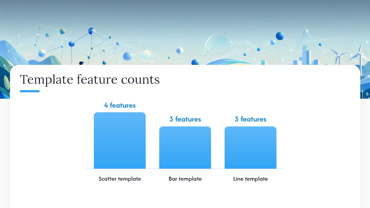
| Template | Format | What it includes |
|---|---|---|
| Scatter plot with trendline | Google Sheets | Pre-formatted axes, trendline, R² display, error bar columns |
| Bar chart with error bars | Google Sheets | SD formula built in, legend, accessible color palette |
| Line graph (time series) | Microsoft Excel | Date-formatted X-axis, gridlines, marker styles for two series |
To use any of these templates: open the linked file, go to File > Make a copy (Sheets) or File > Save As (Excel), then replace the sample data with your own. Delete the placeholder axis labels and type your variable names and units. Export using the steps in Section 4.
For additional examples of how graphs appear in successful IAs, the ESS IA examples collection on Esstutor is a practical reference.
What I see students struggle with most on IA graphs
Most students I work with know their data well. The gap is almost always in presentation: they understand what their results mean, but they have not shown the examiner that they understand it. A graph with missing units or no error bars makes it look like the student did not think carefully about their data, even when they did.
The sessions I find most useful are the ones where we look at a student’s draft graph together and ask: “What would an examiner see in the first five seconds?” Usually, the answer reveals one or two quick fixes that make a significant difference to the mark. Annotated exemplars, like the ones in the section above, work well as coaching tools because they make the contrast between weak and strong presentation concrete rather than abstract.
If you are working on your ESS IA and want that kind of focused, graph-by-graph feedback, Esstutor offers exactly that.
Esstutor can help you get your ESS IA graphs right
Getting your graphs to examiner standard is one of the highest-return things you can do for your IA score. Esstutor offers one-on-one sessions focused specifically on IA data presentation: reviewing your draft figures against the rubric, walking through Google Sheets or Excel step by step, and giving you feedback on captions, error bars, and graph type choices before you submit.
Sessions are flexible and scheduled around your timeline. Tutoring supports your work; it does not write your IA for you. Every graph, every interpretation, and every caption stays yours. That is how it should be, and that is how Esstutor works.
Ready to get rubric-aligned feedback on your figures? Book an IA tutoring session and bring your draft graphs to your first lesson.
Sources
These resources are worth bookmarking as you work through your IA graphs.
No Comments